Estimated reading time: 11 minutes
Key Takeaways
- Typography shapes your brand identity and tells your story visually.
- Different font categories—serif, sans serif, script, display, handwritten, and decorative—serve unique purposes in branding.
- Google Fonts is an accessible and cost-effective resource for selecting versatile typography for your brand.
- Choosing the right fonts builds trust, evokes emotions, and creates instant recognition for your business.
- Your Ultimate Typography Guide acts as a foundation for creativity and consistency across all design elements.
Table of contents
- The Power of Typography in Branding
- Exploring Different Style Categories In Your Ultimate Typography Guide
- Google Fonts: Your Best Friend For Your Ultimate Typography Guide
- The Ultimate Typography Guide: The Cornerstone of Your Brand Identity
- Finishing Your Ultimate Typography Guide
- Keeping Your Brand Organized with Your Ultimate Typography Guide
Are you ready to make a memorable business identity with the ultimate typography guide for your brand?
Typography isn’t just about choosing a pretty font—it’s the secret sauce that breathes personality into your brand and tells your business story without saying a word. In today’s visually driven market, typography has evolved into one of the most critical elements in branding design. It communicates your brand’s essence, sets the mood, and can even nudge potential customers toward saying, “Yes, I want to work with these people!”
In this blog, we’ll take a deep dive into typography for branding design, exploring the different style categories—from the timeless elegance of serifs to the modern cool of sans serifs and beyond—and shine a spotlight on Google Fonts, a treasure trove for every designer. We’ll also explore why picking the right typeface is the very first step in branding your new business. So, buckle up and let’s get geeky with fonts! Enjoy your Ultimate Typography Guide!
The Power of Typography in Branding
Imagine meeting someone for the first time. The first impression is critical, right? Now, consider your brand. The typography you choose acts like that charming introduction—it speaks volumes before you even utter a word. Good typography can make your brand appear professional, friendly, and trustworthy. Conversely, the wrong font might scream “amateur hour” faster than you can say “Comic Sans” (yes, we’ve all been there).
When you choose a typeface, you’re not just picking a style; you’re choosing a personality for your brand. Think about how some brands are instantly recognized by their font style. It’s all about the emotional connection—serious, playful, modern, or traditional—each typeface sends a unique message to your audience. Typography sets the stage, builds credibility, and makes your brand memorable.
As you explore fonts and choose your favorites, be sure to update your ultimate typography guide as you go – it makes life easier that way!
Exploring Different Style Categories In Your Ultimate Typography Guide
Now, let’s break down the main style categories in typography. Whether you’re designing a chic boutique brand or a tech-savvy startup, there’s a typeface category that speaks directly to your audience.
Serif Fonts
Serif fonts are like that dependable friend who always has your back. They have small lines or decorative strokes at the end of each letter—those charming little details called “serifs.” Think of classic fonts like Times New Roman, Georgia, or Baskerville. Serif fonts evoke a sense of tradition, reliability, and sophistication. They’re perfect for brands that want to convey authority, history, or luxury.
When to Use:
- Legal firms, editorial publications, and upscale brands
- Businesses wanting to highlight tradition and trustworthiness
Pros:
- Conveys a sense of formality and tradition
- Great for long texts as they enhance readability in print
Cons:
- May appear too traditional for ultra-modern or minimalistic brands
Sans Serif Fonts
These fonts are the cool, modern cousin in the typography family. “Sans” means “without” in French, so these fonts are without the decorative strokes. Think Helvetica, Arial, or Futura. Sans serifs are clean, straightforward, and exude a modern aesthetic. They’re the go-to for digital content where clarity and readability are paramount.
When to Use:
- Tech startups, contemporary brands, and user interfaces
- Situations requiring a clean, minimalistic look
Pros:
- Clean and highly legible on screens
- Versatile and modern, adaptable to various design aesthetics
Cons:
- Can sometimes lack personality if overused without creative touches
Script Fonts
Script fonts are the handwritten notes of typography. They mimic cursive handwriting, offering a personal, artistic touch that can range from elegant to playful. Examples include Brush Script and Lobster. They’re best used sparingly, as they can sometimes compromise readability if overdone.
When to Use:
- Wedding invitations, boutique branding, or any scenario where a personal, human touch is desired
- Adding emphasis or flair to headlines and logos
Pros:
- Adds a personal, elegant, or whimsical vibe
- Perfect for special occasions or luxury branding
Cons:
- Can be difficult to read in large blocks of text
- Risk of appearing overly decorative if not balanced with simpler fonts
Display Fonts
Display fonts are the divas of typography. They’re designed to grab attention and are often used for headlines, logos, or any situation where you need to make a statement. These fonts come in many shapes and styles—bold, quirky, or ornate. They’re not meant for body text but for making a memorable impact.
When to Use:
- Logos, advertisements, and headlines where impact is crucial
- Brands that want to stand out with a unique style
Pros:
- Highly distinctive and can become the signature element of a brand
- Great for drawing attention in marketing materials
Cons:
- Not suitable for long texts
- Risk of overpowering other design elements if not used judiciously
Handwritten and Calligraphic Fonts
Handwritten fonts give a sense of casual charm and authenticity, often used to add a personal touch to designs. They can be playful or elegant, depending on the style. These fonts are perfect when you want to appear approachable and down-to-earth.
When to Use:
- Craft brands, creative agencies, or any business wanting to exude warmth and approachability
- Supplementing a brand’s visual identity in a friendly manner
Pros:
- Creates a unique, personal feel
- Versatile in tone—can be playful, artistic, or even vintage
Cons:
- May not be as legible as more standardized typefaces
- Can clash with more formal design elements if not used properly
Decorative Fonts
Decorative fonts are the wild cards of typography. They’re highly stylized and are best used for one-off projects like posters or special event invitations. They scream creativity and individuality, but tread carefully—overuse can dilute your brand’s message.
When to Use:
- Event posters, promotional materials, or creative projects
- Brands that want to emphasize a quirky, unconventional personality
Pros:
- Highly distinctive and memorable
- Can instantly convey a unique brand identity
Cons:
- Not versatile for all kinds of media
- Limited in readability for longer texts
Google Fonts: Your Best Friend For Your Ultimate Typography Guide
Let’s shift gears and talk about a resource that’s become indispensable for designers: Google Fonts. If you haven’t yet explored the vast repository of free, open-source fonts on Google Fonts, you’re missing out on one of the best tools in your design arsenal. Here’s why Google Fonts deserves a top spot in your branding toolkit.
What Are Google Fonts?
Google Fonts is a massive library of free-to-use fonts that you can integrate into your digital and print projects without spending a dime. Whether you’re looking for the classic elegance of a serif, the modernity of a sans serif, or the playful twist of a script, Google Fonts offers a diverse range of options that cater to every design need.
Why Google Fonts is a Game-Changer For Your Ultimate Typography Guide
1. Free and Open Source:
Google Fonts is completely free, which means you can experiment with different fonts without worrying about licensing fees. This is particularly beneficial for startups and small businesses that need to maximize their budgets while still looking professional.
2. Easy Integration:
One of the best parts about Google Fonts is how seamlessly it integrates with various platforms. Whether you’re designing a website, creating marketing materials, or building a logo, Google Fonts makes it easy to incorporate beautiful typography with just a few lines of code.
3. Versatility and Consistency:
A cohesive brand identity relies on consistency. Google Fonts allows you to maintain a uniform look across different mediums. You can choose a combination of fonts that work well together—for example, pairing a clean sans serif for body text with an elegant serif for headlines—to create a harmonious visual narrative.
4. Constant Updates and Community Support:
Google Fonts is continually updated with new typefaces, ensuring that you always have access to modern and innovative designs. Moreover, the community of designers using Google Fonts contributes to a rich ecosystem of ideas and inspiration.
How to Use Google Fonts in Your Ultimate Typography Guide
When starting your branding journey, typography is one of the first elements you should nail down. Here’s how you can leverage Google Fonts to set the stage:
- Experiment and Explore: Spend time browsing through the extensive catalog of Google Fonts. Look for fonts that resonate with your brand’s personality. Are you going for a modern, minimalistic look? Perhaps a sans serif is the way to go. Want to evoke a sense of tradition and reliability? A serif might be the perfect match.
- Pairing Fonts: Don’t be afraid to mix and match. A well-chosen pair of fonts can create visual harmony. Google Fonts often provides pairing suggestions, which can be a great starting point if you’re not sure where to begin.
- Test for Readability: While style is important, don’t sacrifice readability. Ensure that the fonts you choose are legible across different devices and screen sizes. Remember, your content should be as easy on the eyes as it is on the brain.
- Stay Consistent: Use your chosen fonts consistently across all brand materials—from your website to business cards. Consistency helps reinforce your brand identity and makes your business instantly recognizable.
Why Is Google Fonts the First Step in Branding Your New Business?
Imagine trying to build a house without a solid foundation. It sounds absurd, right? The same goes for branding. Your typography is the cornerstone of your visual identity. It sets the tone for how your audience perceives your brand. Here’s why starting with typography—and Google Fonts, in particular—is crucial:
Creating an Immediate Connection:
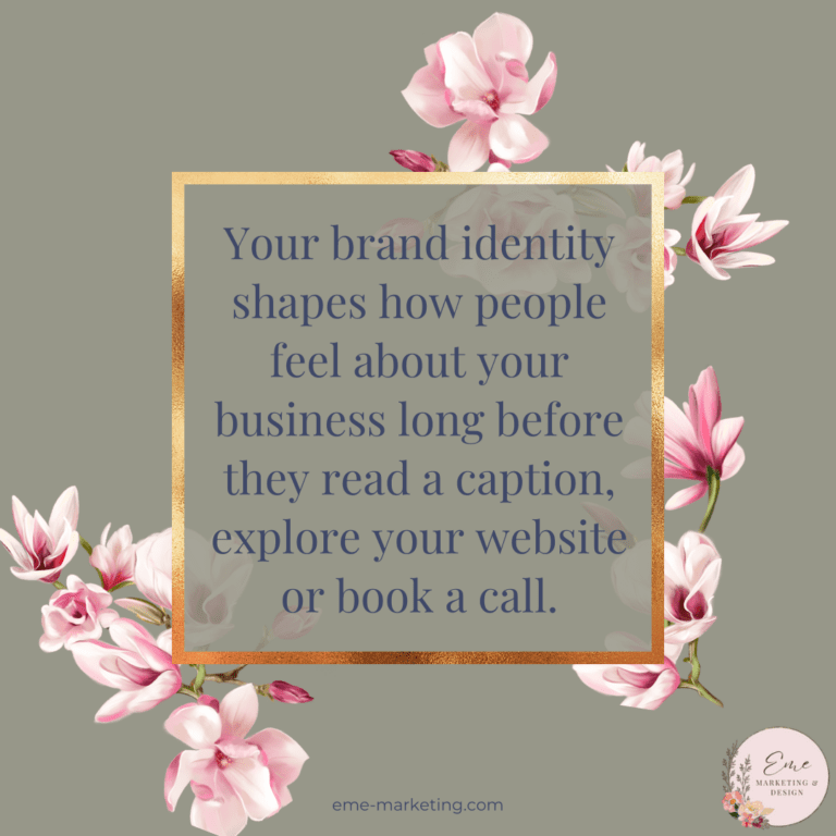
Your font choice is one of the first things a potential customer will notice about your brand. It speaks directly to their subconscious, conveying emotions and values before they even read a word of your copy. A well-chosen font can instill trust, convey expertise, or even spark curiosity.
Establishing Consistency:
Once you pick your typography, it serves as the foundation for all your visual communications. Whether it’s your website, your social media posts, or your business cards, consistent typography reinforces your brand identity and makes your business more memorable. With Google Fonts, you can ensure that your chosen style is accessible and consistent across digital and print formats.
Cost-Effective and Accessible:
For startups and small businesses, budget constraints can be a real concern. Google Fonts offers a cost-effective solution without compromising quality. It allows you to create a professional look without having to invest in expensive typefaces, making it an ideal first step in your branding journey.
Flexibility for Future Growth:
Starting with a versatile, high-quality typeface from Google Fonts gives you a robust base to build upon as your business grows. It’s adaptable to various design needs and trends, ensuring that your brand remains current and relevant over time.
The Ultimate Typography Guide: The Cornerstone of Your Brand Identity
When you’re launching a new business, every design decision is crucial. Typography isn’t just a cosmetic choice; it’s a strategic tool that communicates your brand’s values and vision. Here’s a quick recap of why typography should be your first step in branding your new business:
- Instant Recognition:
The right font makes your brand instantly recognizable. Think about iconic brands—their fonts are part of what makes them memorable. It’s like giving your business a distinct voice that resonates with your audience. - Building Trust:
A professional, carefully chosen typeface communicates reliability. Whether you’re targeting a modern audience with sleek sans serifs or a traditional one with classic serifs, the right typography builds trust from the get-go. - Emotional Connection:
Every font has its personality. From the playful curves of a script font to the bold impact of a display typeface, your choice of typography can evoke emotions that align with your brand’s messaging. It’s a subtle yet powerful way to connect with your audience on a deeper level. - Versatility Across Mediums:
In today’s multi-channel world, your brand must look cohesive on every platform. Whether it’s on a smartphone screen or a printed brochure, consistent typography ensures that your message is clear and unified. - A Launchpad for Creativity:
Starting with a strong typographic foundation gives you a creative springboard. Once you have your fonts locked down, you can build your entire visual identity around them, creating a cohesive and engaging brand experience.
Finishing Your Ultimate Typography Guide
As you embark on your branding journey, remember that typography is more than just letters on a page—it’s the visual language of your business. By carefully selecting and pairing fonts, you set the stage for a brand identity that’s not only aesthetically pleasing but also deeply resonant with your target audience. Google Fonts provides a fantastic starting point, offering a vast, free, and accessible library of fonts that cater to every design need.
From the classic charm of serif fonts to the modern edge of sans serifs, the personal touch of script fonts, and the bold statements of display fonts, every typeface has its role to play in telling your brand’s story. So, take your time, experiment, and find the perfect mix that speaks to the heart of your business.
Typography is your brand’s first impression, its personality, and its promise—all wrapped up in beautifully designed letters. It’s the quiet hero that works behind the scenes to make your brand unforgettable. So, go ahead—dive into the world of typography, explore Google Fonts, and let your brand speak volumes without saying a word.
Keeping Your Brand Organized with Your Ultimate Typography Guide
In the ever-evolving landscape of design, staying true to your brand’s voice is paramount. Your choice of typography is the first step in establishing that voice. It’s a decision that will echo through every piece of content you produce, every interaction with your audience, and every milestone your business achieves. Embrace it, experiment with it, and most importantly, have fun with it. After all, your brand is a living, breathing entity, and every element—from color schemes to typography—plays a crucial role in its narrative.
So, as you stand at the beginning of your branding journey, remember: the right font isn’t just a design choice—it’s a declaration of who you are and what you stand for. Choose wisely, and watch as your brand comes to life in ways you never imagined. You’ll be happy you have your ultimate typography guide in your pocket.
Learn more about branding here.
Happy designing, and may your fonts always be on point!